AirWise: Your airport companion for navigation, flights & assistance.
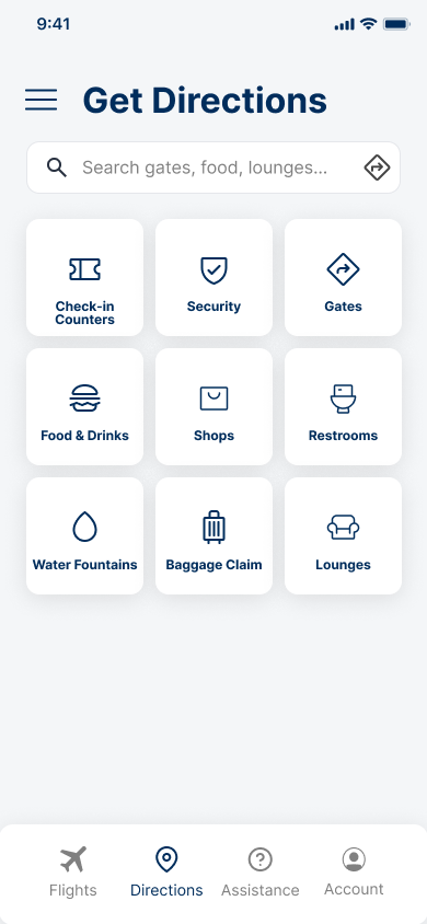
A handy app which offers you flight status updates, interactive maps, and details about facilities such as restrooms and food options. Additionally, you can find information about baggage claims and security checkpoints. You can set reminders and get notifications.
Most travellers arrive two hours early just to feel safe. They ask staff for directions, and when a flight gets delayed, they stand around with no idea what to do next. The airport isn't always the problem. The lack of clear information is.

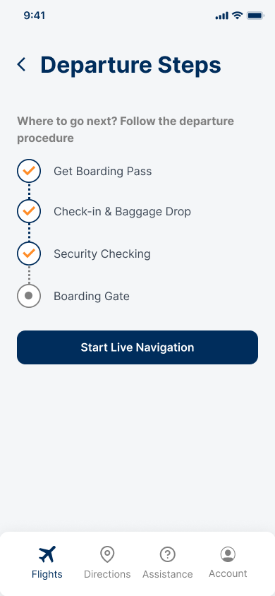
Navigating is guesswork
Travellers stop multiple times to reconfirm directions. Wrong turns at unfamiliar terminals cost time and add anxiety.

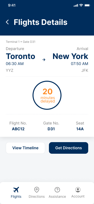
Delays leave people stranded
A delayed flight and no guidance. Travellers don't know where to wait, what to do, or who to talk to.

Peak hours are chaotic
Long queues and overwhelmed counters during holidays push solo travellers toward self-serve options that don't exist yet.
My Role
Solo UX Designer, end to end
Timeline
4 weeks, May to July 2023
Tools
Figma, Slack
Methods
Interviews, Personas, User Flows, Prototyping, Usability Testing
A 4-week human-centred design sprint. Each week had one clear focus.
Designing for everyone, not the tech-savvy
My three interview participants wanted entirely different things. The mother needed kids' facilities. The solo traveller wanted to skip queues. The first-timer needed someone to tell them what to do next.
Onboarding asks three things upfront: language, mobility needs, and traveller type. Each answer shapes what the app surfaces first.
Offline mode was non-negotiable
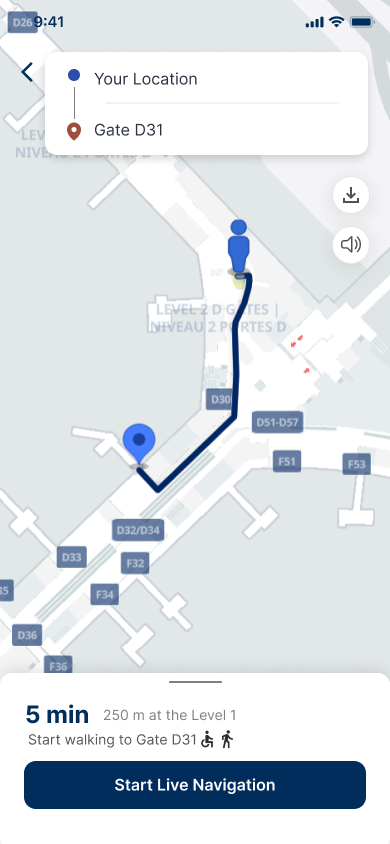
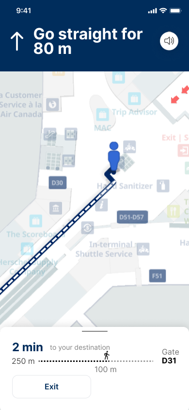
Airport Wi-Fi is unreliable. If the app fails when someone is lost at Gate D31, it's useless. Offline support was a non-negotiable constraint.
Offline map downloads added to the Directions feature. Travellers cache the airport layout before arriving. I tested this specifically in usability sessions.
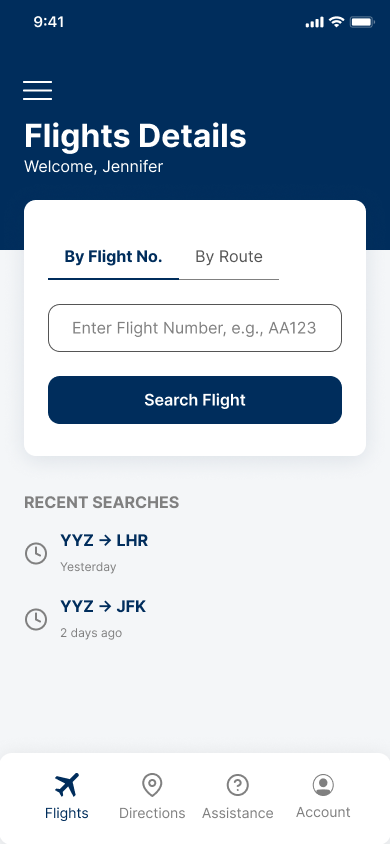
AirWise consolidated all of them into one interface.
Tested with 5 real travellers, scored 4.2 out of 5
What tested well
The core experience is solid. These gaps remain.
Next project
Richard Bod Photography