Designing an ecommerce experience for Richard Bod Photography
Wildlife photography is a hard sell digitally — buyers need to see the work up close, understand their options, and feel confident before they buy something for their wall. Richard had the photography. He just didn't have a store. I designed one that reflected the quality of his work and ran without my ongoing help.
Role
UX Designer + Developer
Timeline
3 weeks
Platform
Squarespace Commerce
Scope
Ecommerce + Mentorship booking
Every sale was a manual process
Visitors who wanted prints had to reach out directly, and Richard would personally quote them, send an invoice, and coordinate delivery by hand. It was a long process, with no store, product pages, or checkout in place.
Product information was invisible
Buyers used to ask about print sizes, materials, and framing options. That interest was there, but the site couldn't answer those questions yet.
Mentorship was in demand
People were reaching out to Richard on social media asking if he offered mentorship or lessons. He had something worth offering, but there was no place on the site to find it, understand it, or book it.
Competitive Insights
I looked at how top photographers sell their work online. The goal was to find the sweet spot between a beautiful gallery and a functional store.
Let the Art Speak for Itself
Like Peter McKinnon's store, the interface needs to step back. No loud buttons or distracting colors. The photography must be the primary focus, with buying tools feeling invisible until needed.
Step-by-step choices reduce decision fatigue
Showing all sizes, materials, and framing options on screen at once is overwhelming. Cassidy Lynne's booking flow reveals options one at a time, and that same logic applies here.
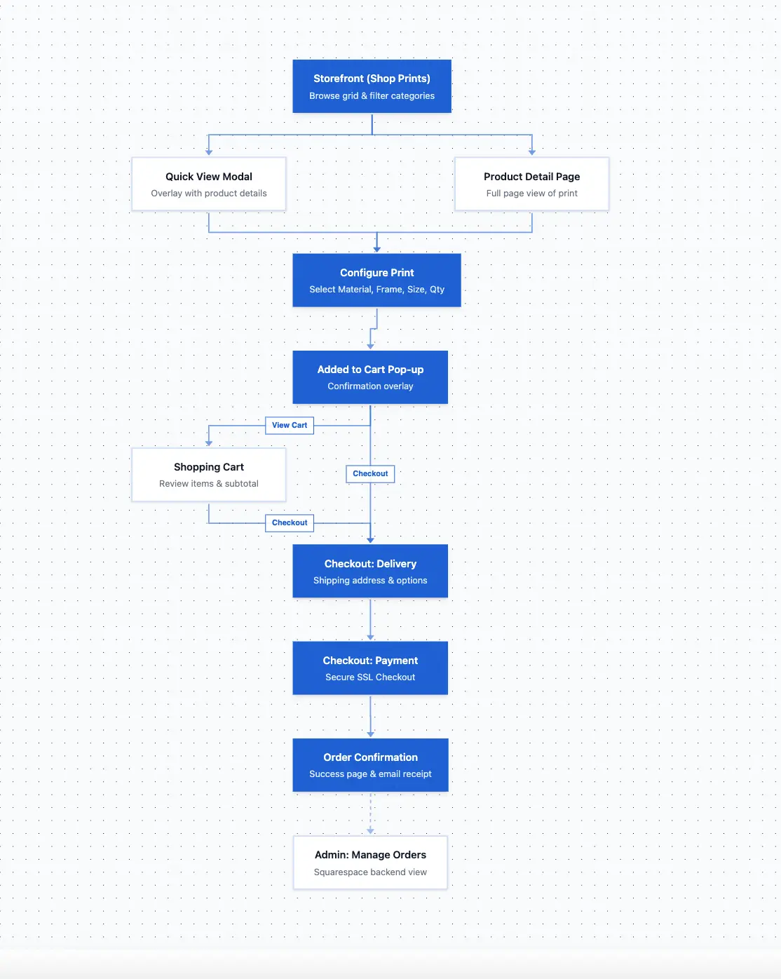
Information Architecture
The riskiest moment in the flow turned out to be the handoff from Quick View to the product page — the point where a visitor leaves the catalog grid and loses their browsing context. That single insight drove the decision to keep the sidebar filters visible and active throughout the entire purchase journey.
The thinking behind each design decision
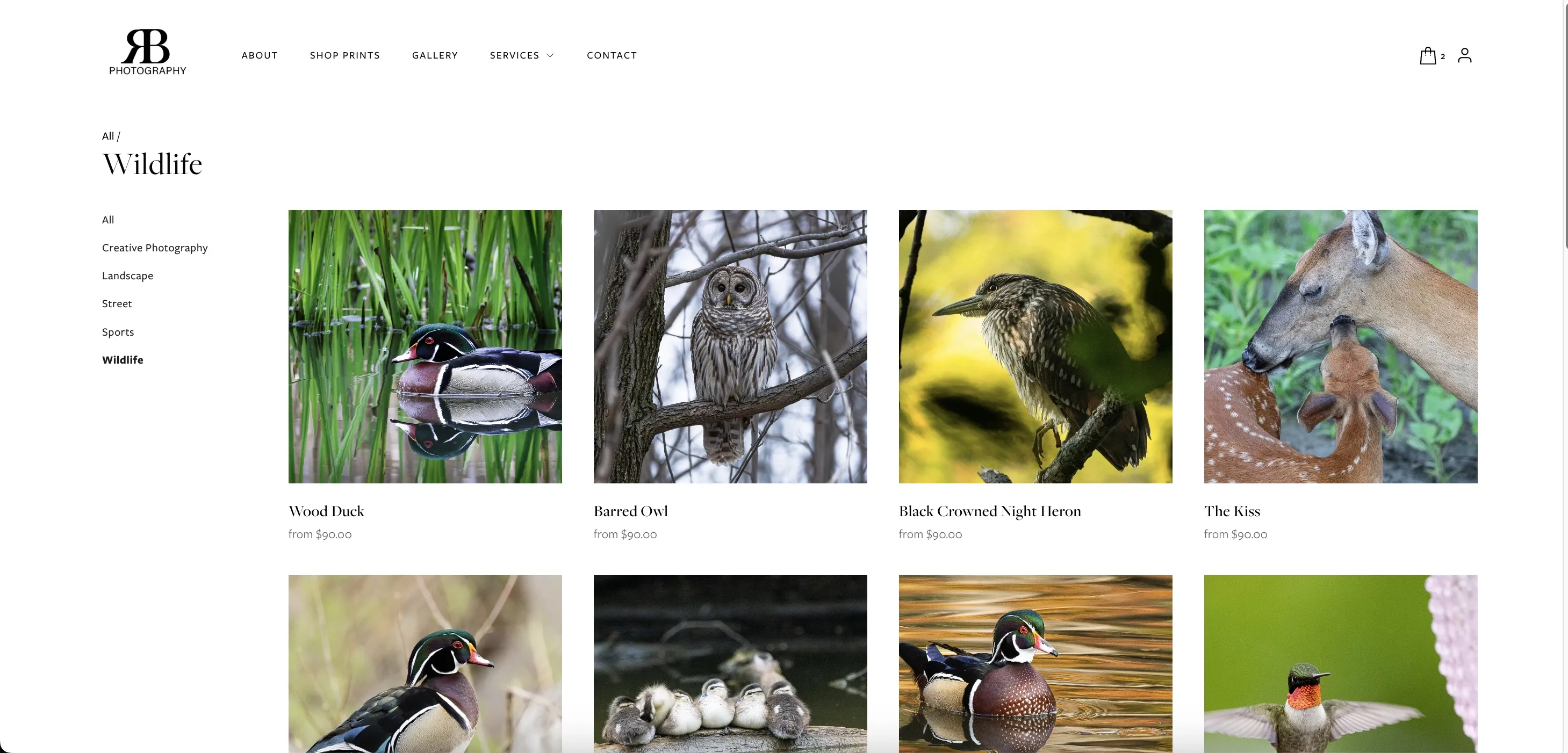
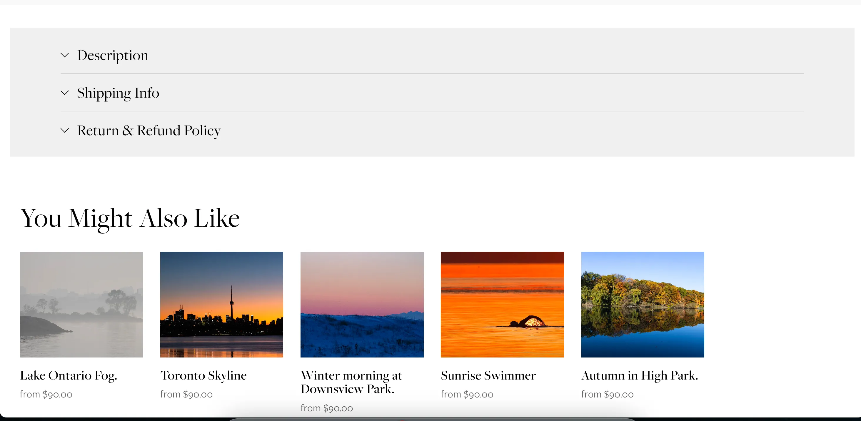
Making 30+ products browsable without overwhelming anyone
The catalog's usability problem wasn't the number of products — it was orientation. Visitors who lose their place in a catalog tend not to rebuild it. Every navigation decision here was made around keeping context intact.
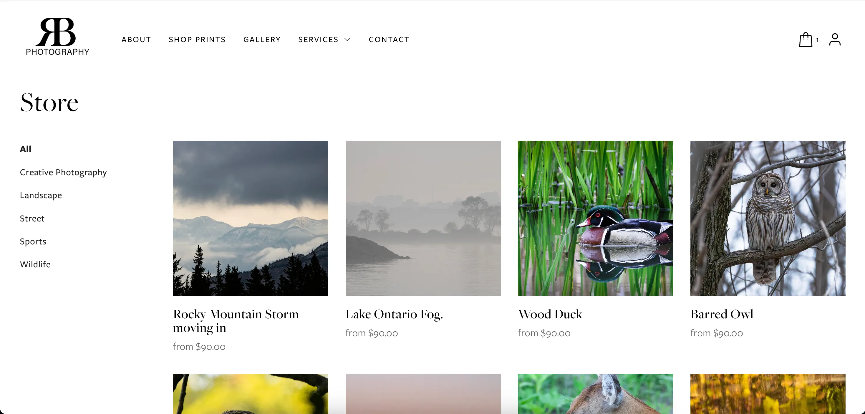
A catalog of this size needs to feel explorable, not searchable
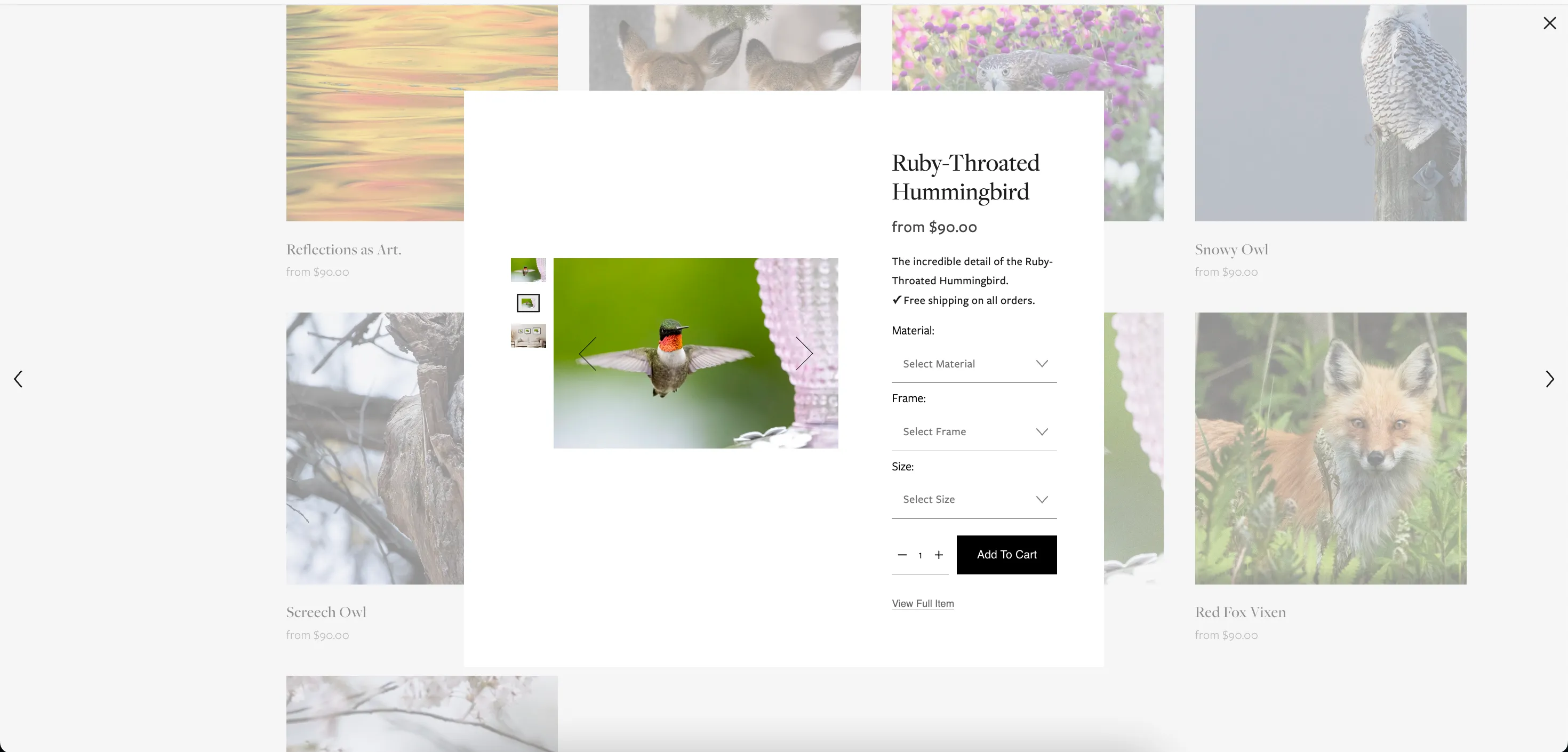
Evaluating a print and committing to it are two different moments
Turning variant complexity into a manageable decision
Each print has multiple size, frame, and material options — each combination at a different price point. The design challenge was making that feel like three small decisions, not one overwhelming form.
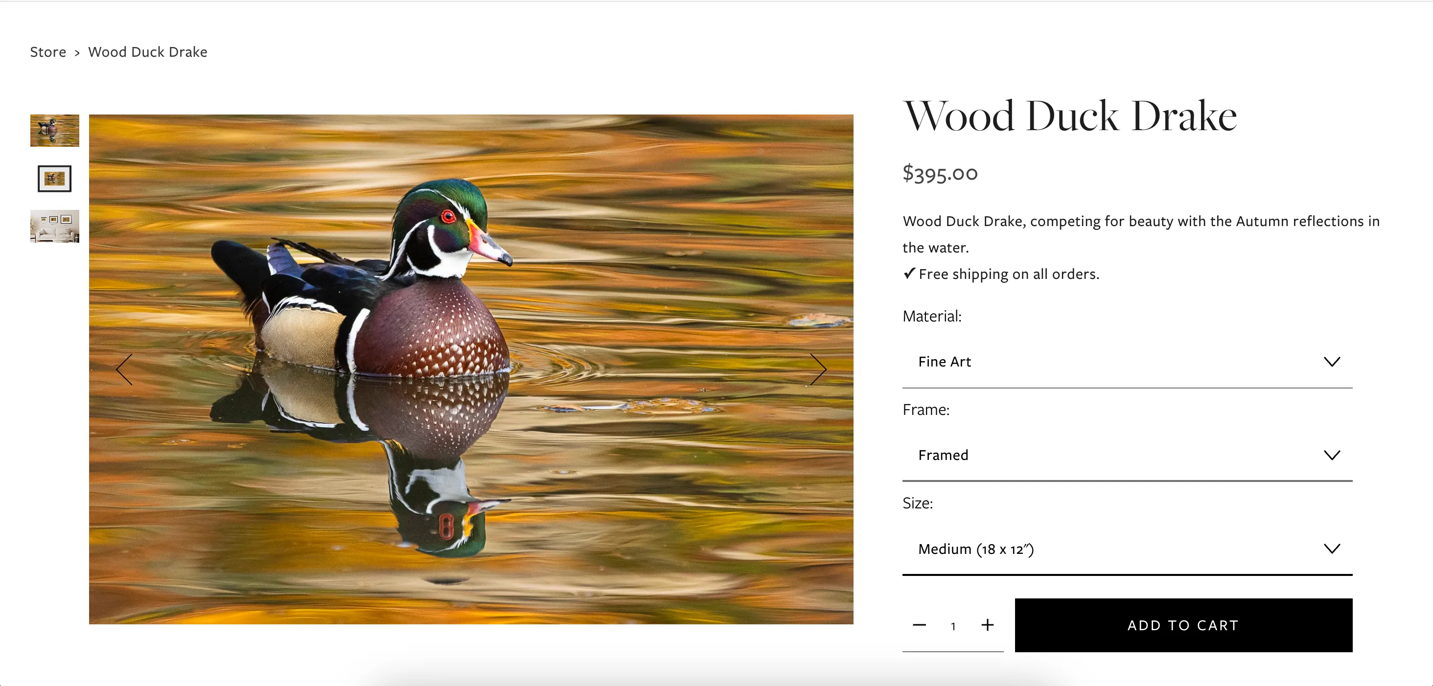
Variant overload is the conversion killer in print stores
The conversion area needs to stay uncluttered
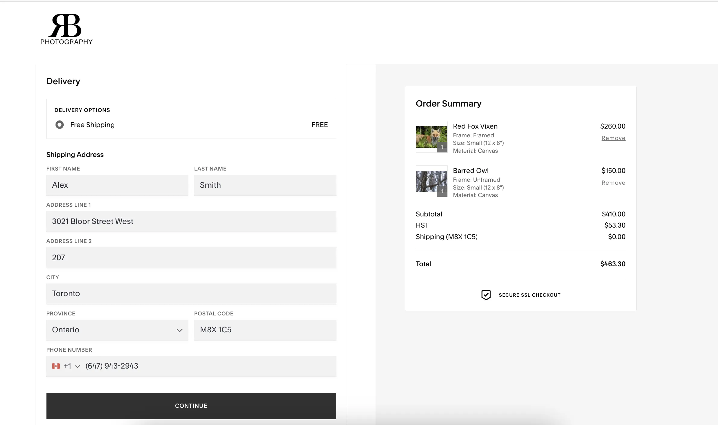
Replacing a manual process with a real checkout pipeline
Before this project, every transaction was: visitor emails Richard, Richard quotes, Richard invoices, Richard follows up. The design work here was replacing that chain with something automated and self-contained.
Formalizing mentorship from DMs into a bookable service
He'd been running photography workshops informally through Instagram for years. The design work was giving it the structure of a real service — tiers, pricing, and a page that signaled it was worth paying for.
A store that runs without Richard in the middle of every sale
Delivered
What I'd do next
Map where the conversion breaks down
Are visitors filtering but not clicking? Configuring but not checking out? Funnel analytics would isolate where the drop-off happens and whether it's a design problem or an expectation mismatch.
Test whether the variant sequence is right
The current order — material, frame, then size — is a hypothesis. A live visual preview that updates as you configure might reduce decision fatigue more than the sequential dropdown approach.
Build trust for the higher-priced mentorship tiers
The top tiers are hard to evaluate without evidence. Work from the first cohort — outcomes, photographs, testimonials — would carry more weight than anything in the copy.
Next project
AirWise