Designing light and dark mode for an analytics dashboard
Building a two-theme colour system for a data-heavy dashboard, using surface elevation instead of shadow and measuring every token against WCAG 2.1.
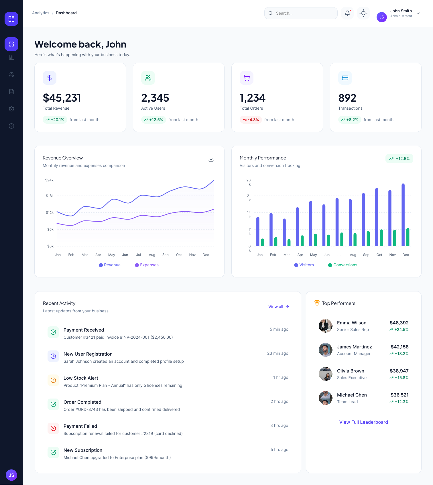
The dashboard in light mode, as shipped.
The problem
Analytics dashboards get long sessions. People sit with them for hours, often in low light. A single light theme forces a bright surface into that context, and most teams solve it by inverting the palette, which breaks on data.
I designed both themes as one system instead, so every colour has a defined behaviour in each.
The dashboard in light mode, as shipped.
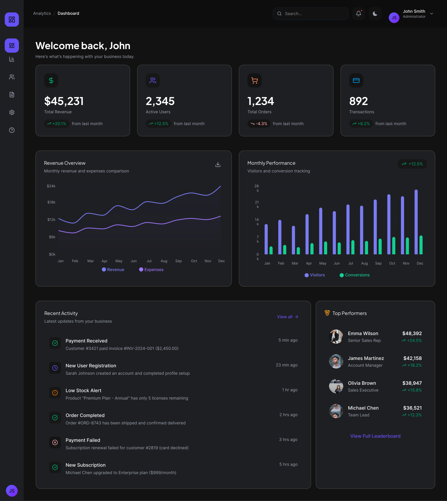
The same screen in dark mode, using the surface and accent tokens from this system.
I designed the main dashboard screen. It carries every component type in the product, stat cards, line chart, bar chart, activity list, and status chips, so the token decisions made here apply to every other screen.
Designing the dark surfaces
Light mode uses shadow to separate a card from the page. On a dark surface a shadow has nothing to fall on, so cards flatten into the background.
Dark mode replaces shadow with value. The page sits at the darkest step, cards sit one step lighter, and hover sits lighter again. Elevation becomes a colour token instead of a shadow token.
I also avoided pure black. A near-black surface at #0F0F12 keeps the shadow of an overlay visible and reduces the halo effect white text creates on true black.
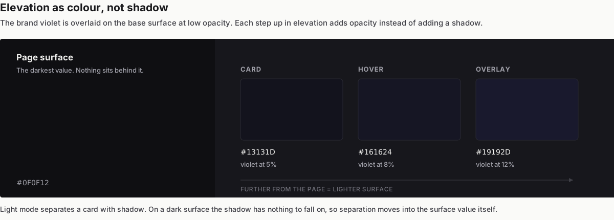
Elevation expressed as surface value, with the brand violet overlaid at 5, 8, and 12 percent.
Adapting the brand colour
Saturated colour that works on white vibrates on a dark surface. The violet brand accent was the clearest example.
In light mode the accent sits at full saturation. In dark mode I stepped it lighter and less saturated so it holds its identity without straining at length.
The same rule applied to the chart. Revenue and Expenses shared one violet in the original light theme, which was already weak, and got worse when contrast dropped. I split them into two distinguishable steps of the same hue so the series stay readable without adding a second brand colour.
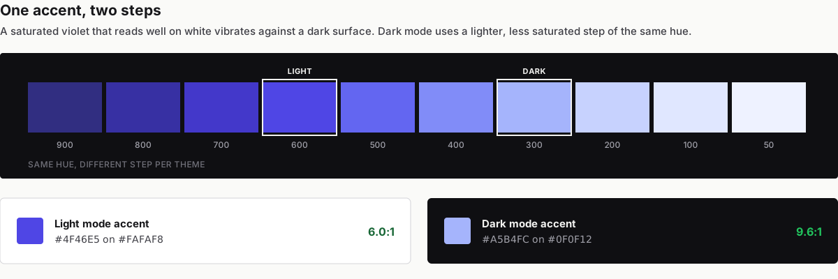
The same hue at two steps, one per theme, with the measured ratio for each.
Defining status colours
Status chips carry the only colour in the interface that users act on. Green means revenue moved up. Red means a payment failed.
The original light theme reused one green and one red across both chips and both themes. That green measured 3.0:1, which fails AA before dark mode enters the picture.
I defined each status colour as a pair, one foreground and one surface per theme, rather than one hex reused everywhere.
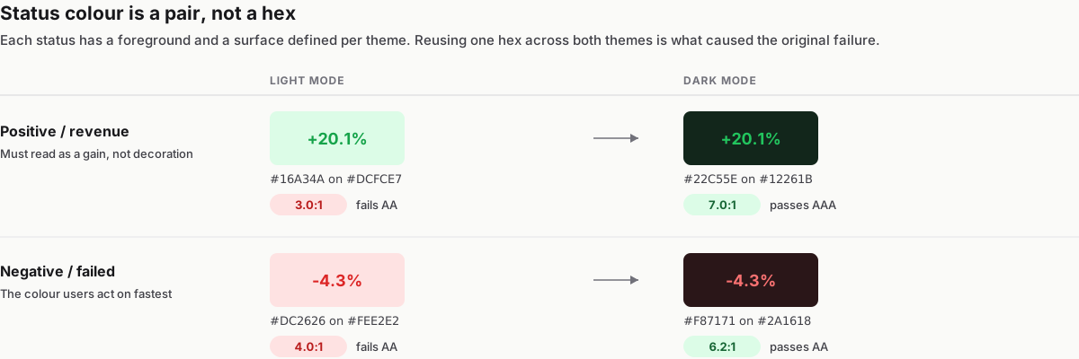
Each status defined as a foreground and surface pair per theme.
Testing contrast
Every token in the system was measured against its own background in both themes. Nothing shipped on judgement alone.
| Token | Light mode | Ratio | Dark mode | Ratio |
|---|---|---|---|---|
| Positive / revenue | #16A34A on #DCFCE7 |
3.0:1 | #22C55E on #12261B |
7.0:1 |
| Negative / failed | #DC2626 on #FEE2E2 |
4.0:1 | #F87171 on #2A1618 |
6.2:1 |
| Body text | #18181B on #FAFAF8 |
17.0:1 | #F2F2F0 on #0F0F12 |
17.1:1 |
WCAG AA requires 4.5:1 for normal text, 3:1 for large text/icons. Both status chips fail AA in light mode as shipped — dark mode isn't the only theme with a problem here.
Next steps
- Extend the token set to the remaining screens.
- Test the two chart line colours with users who have colour vision deficiency, since value separation alone may not be enough.
- Add a system preference default so the theme follows the operating system instead of a manual toggle.
Selected work
Full case study (PDF)
→ Add link to full write-up
Figma file
→ Add link to design file
Portfolio home
→ Back to projects
Next project
Richard Bod Photography